Responsive Layouts with CSS Grid and Flexboxes
Created for
Created by

The Flexbox Layout model
The Flexbox Layout model
Overview
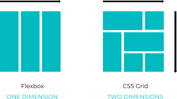
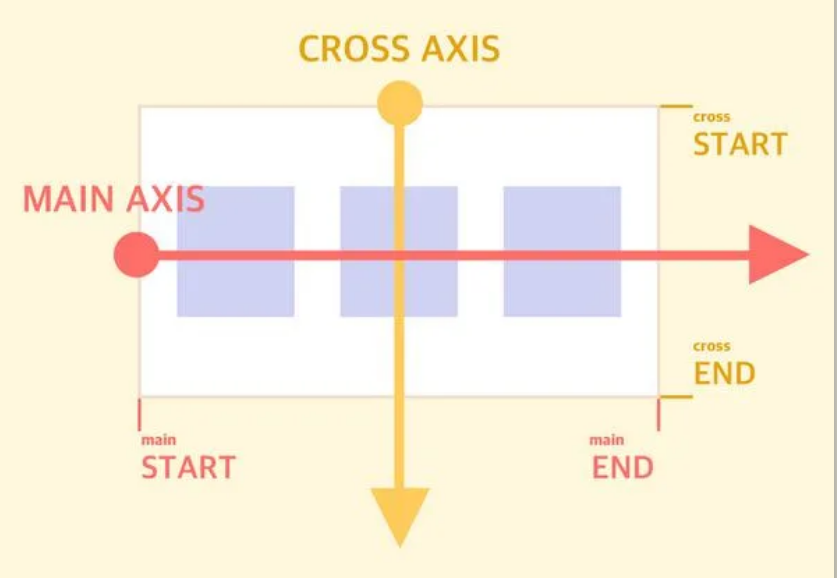
- The Flexbox model is a one-dimensional method for laying out items in rows or columns.
- It is a powerful layout model, which provides space distribution between items and alignment capabilities.
- It can also be used as a layout mechanism, though for more complicated layouts the two-dimensional
grid layoutis preferred.
Flexbox: the Basics
Flex Container Properties
Flex Item Properties
Demo 1: Holy Grail Layout
See the Pen HolyGrail_flexbox_layout by Iva Popova (@webdesigncourse) on CodePen.
Demo 2: Absolutely centered flex menu items
See the Pen absolutelyCenteredFlexItems by Iva Popova (@webdesigncourse) on CodePen.
Demo 3: Proportionally spaced menu items
See the Pen Proportionally spaced Menu (Flexboxes) by Iva Popova (@webdesigncourse) on CodePen.
Demo 4: Cards styling with Flex and order random shuffle
See the Pen style and shuffle Cards with Flexbox by Iva Popova (@webdesigncourse) on CodePen.
Flexbox - playground
The Grid Layout model
The Grid Layout model
Overview
- CSS Grid Layout is a two-dimensional layout system
- A grid is a collection of horizontal and vertical lines creating a pattern against which we can line up our design elements
Basic concepts

Demo 1: Flexible items with CSS Grid
See the Pen flexible items with CSS Grid by Iva Popova (@webdesigncourse) on CodePen.
Demo 2: Cards styling with Grid and order random shuffle
Note, that order property on Grid works as in order property in Flexbox. So basically, the shuffleCard() function is the same as in Flex Demo.
See the Pen style and shuffle Cards with Grid by Iva Popova (@webdesigncourse) on CodePen.
These slides are based on
customised version of
framework