Keyboard shortcuts:
N/СпейсNext Slide
PPrevious Slide
OSlides Overview
ctrl+left clickZoom Element
If you want print version => add '
?print-pdf' at the end of slides URL (remove '#' fragment) and then print.
Like: https://wwwcourses.github.io/...CourseIntro.html?print-pdf
Created for

Iva E. Popova, 2022-2023,

Create applications with QMainWindow
Create applications with QMainWindow
Get familiar with MainWindow
- Qt has QMainWindow and its related classes for main window management.
- QMainWindow has its own layout to which you can add QToolBars, QDockWidgets, a QMenuBar, and a QStatusBar.
- The Main Window of an application is created as instance of QMainWindow Class
- Main windows have either a single (SDI) or multiple (MDI) Document Interface.
- You can create MDI applications by using a QMdiArea as the central widget.
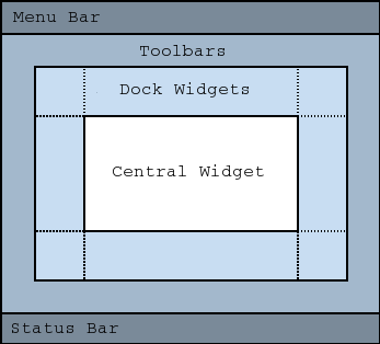
MainWindow Central Widget
- A central widget will typically be a standard Qt widget such as a QTextEdit
- Custom widgets can also be used for advanced applications
- You set the central widget with setCentralWidget().
			self.textedit = qtw.QTextEdit()
			self.setCentralWidget(self.textedit)
MenuBar
- A menu bar consists of a list of pull-down menu items
- QMainWindow provides an empty QMenuBar object by default.
- To get access to this menu bar, you need to call .menuBar() on your QMainWindow object.
- You add menu items with addMenu()
			# get the menu bar
			menubar = self.menuBar()

			# add menu items
			file_menu = menubar.addMenu('File')
			edit_menu = menubar.addMenu('Edit')
			help_menu = menubar.addMenu('Help')
- The ampersand in the menu item's text sets Alt+Symbol as a shortcut for this menu.
			# add menu items
			file_menu = menubar.addMenu('&File')
			edit_menu = menubar.addMenu('&Edit')
			help_menu = menubar.addMenu('&Help')
ToolBar
- The QToolBar class provides a movable panel that contains a set of controls.
- You add toolbars to a MainWindow with addToolBar()
- To add some toolbar buttons you can use PyQt actions, which are instances of QAction (discussed later)
			toolbar = self.addToolBar('File')

			toolbar.setMovable(False)
			toolbar.setFloatable(False)

			# for Qt6:
			toolbar.setAllowedAreas(
				qtc.Qt.ToolBarArea.TopToolBarArea |
				qtc.Qt.ToolBarArea.BottomToolBarArea
			)

			# for Qt5:
			# toolbar.setAllowedAreas(
			#	qtc.Qt.TopToolBarArea |
			#	qtc.Qt.BottomToolBarArea
			# )
Menu Items and ToolBar Actions
- In applications many common commands can be invoked via menus, toolbar buttons, and keyboard shortcuts
- Since the user expects each command to be performed in the same way, regardless of the user interface used, it is useful to represent each command as an action.
- Actions can be added to menus and toolbars, and will automatically keep them in sync
- Actions can be created as independent QAction objects, but they may also be created during the construction of menus, as shown bellow.
- A QAction may contain an icon, menu text, a shortcut, status text, "What's This?" text, and a tooltip.
			# add actions
			open_action = file_menu.addAction('Open')
			save_action = file_menu.addAction('Save')

			# add separator
			file_menu.addSeparator()

			quit_action = file_menu.addAction('Quit', self.close)
			undo_action = edit_menu.addAction('Undo', self.textedit.undo)

			# create a QAction manually
			redo_action = qtg.QAction('Redo', self)
			redo_action.triggered.connect(self.textedit.redo)

			# Actions, which opens custom dialog
			edit_menu.addAction(redo_action)
			edit_menu.addAction('Set Font…', self.set_font)
			edit_menu.addAction('Settings…', self.show_settings)
Custom ToolBar Actions
- We can create a custom QAction, as well
- And we can use a standard pixmap for icon
			self.help_action = qtg.QAction(
				self.style().standardIcon(qtw.QStyle.StandardPixmap.SP_DialogHelpButton),
				'Help',
				self  # important to pass the parent!
			)

			# add signal
			self.help_action.triggered.connect(lambda : qtw.QMessageBox.information(self,'Not Implemented','Sorry, no help yet!'))

			toolbar.addAction(help_action)
Dock Widgets
- A QDockWidget is a window that can be docked into the main window
- You add dock widgets to a main window with addDockWidget()
- A QDockWidget consists of a title bar and the content area. The title bar displays the dock widgets window title, a float button and a close button (depending on the DockWidget state)
- There are four dock widget areas as given by the Qt::DockWidgetArea enum: left, right, top, and bottom
			dock = qtw.QDockWidget("Replace")
			self.addDockWidget(qtc.Qt.LeftDockWidgetArea, dock)

			# set dock widget to move and float (but not closeable)
			dock.setFeatures(
				# for pyqt6
				qtw.QDockWidget.DockWidgetFeature.DockWidgetMovable |
				qtw.QDockWidget.DockWidgetFeature.DockWidgetFloatable

				# for pyqt5
				# qtw.QDockWidget.DockWidgetMovable |
				# qtw.QDockWidget.DockWidgetFloatable
			)
Add widgets to Dock Widget
- A QDockWidget acts as a wrapper for its child widget, set with setWidget().
			replace_widget = qtw.QWidget()
			replace_widget.setLayout(qtw.QVBoxLayout())

			self.search_text_input = qtw.QLineEdit()
			self.search_text_input.setPlaceholderText('search')
			self.replace_text_input = qtw.QLineEdit()
			self.replace_text_input.setPlaceholderText('replace')

			search_and_replace_btn = qtw.QPushButton(
				"Search and Replace",
				)
			search_and_replace_btn.clicked.connect(self.search_and_replace)

			replace_widget.layout().addWidget(self.search_text_input)
			replace_widget.layout().addWidget(self.replace_text_input)
			replace_widget.layout().addWidget(search_and_replace_btn)
			replace_widget.layout().addStretch()

			dock.setWidget(replace_widget)
The Status Bar
- QStatusBar is a widget (displayed as horizontal bar) that is used to display status information.
- Each status indicator falls into one of three categories:
- Temporary - briefly occupies most of the status bar. Used to explain tool tip texts or menu entries, for example.
- Normal - occupies part of the status bar and may be hidden by temporary messages. Used to display the page and line number in a word processor, for example.
- Permanent - is never hidden. Used for important mode indications, for example, some applications put a Caps Lock indicator in the status bar.
Create Temporary status messages
- the showMessage() slot is used to display a temporary message:
			# create status bar widget and atach it to main window:
			self.status_bar = qtw.QStatusBar()
			self.setStatusBar(self.status_bar)

			# show temporary message for 3 second:
			self.status_bar.showMessage('Welcome to My Text Editor',3000)
Adding Permanent Message to StatusBar
- Adds the given widget permanently to this status bar
			charcount_label = qtw.QLabel("chars: 0")
			self.textedit.textChanged.connect(
				lambda: charcount_label.setText( "chars: " + str(len(self.textedit.toPlainText())) )
			)
			self.status_bar.addPermanentWidget(charcount_label)
Adding images and icons
Adding images and icons
Adding images
- Qt provides four classes for handling image data: QImage, QPixmap, QBitmap and QPicture, where QPixmap is designed and optimized for showing images on screen
- To add an image, first we must load the image using QPixmap
- A QPixmap can easily be displayed on the screen using QLabel or one of QAbstractButton's subclasses (such as QPushButton and QToolButton). QLabel has a pixmap property, whereas QAbstractButton has an icon property.
- Optionally, we may want to resize the label according to the image dimensions.
Example
Set App Icon
- The setWindowIcon() method allows you to set the application icon. To do this, we created a QIcon object, from any downloaded icon image.
				import sys
				from PyQt6 import QtWidgets as qtw
				from PyQt6 import QtCore as qtc
				from PyQt6 import QtGui as qtg


				class MainWindow(qtw.QWidget):

					def __init__(self , *args, **kwargs):
						super().__init__(*args, **kwargs)

						self.setWindowTitle('Icon Demo')
						self.setWindowIcon(qtg.QIcon('./icons/calculator.png'))

						self.show();


				if __name__ == '__main__':
					app = qtw.QApplication(sys.argv);

					window = MainWindow()

					sys.exit(app.exec())
Qt Standard Icons
- Qt ships with a set of standard icons for common actions.
- The icons are all accessible through the current active application style -- available as a series of flags, which can be passed to .standardIcon to get the icon.
- The following script can be used to display all the built-in icons.
				import sys

				from PyQt6.QtWidgets import (QApplication, QGridLayout, QPushButton, QStyle, QWidget)


				class Window(QWidget):
					def __init__(self):
						super(Window, self).__init__()

						icons = sorted([attr for attr in dir(QStyle.StandardPixmap) if attr.startswith("SP_")])
						layout = QGridLayout()

						for n, name in enumerate(icons):
							btn = QPushButton(name)

							pixmapi = getattr(QStyle.StandardPixmap, name)
							icon = self.style().standardIcon(pixmapi)
							btn.setIcon(icon)
							layout.addWidget(btn, int(n/4), int(n%4))

						self.setLayout(layout)


				app = QApplication(sys.argv)

				w = Window()
				w.show()

				app.exec()
Set Widget's Icon - Example
			import sys
			from PyQt6 import QtWidgets as qtw
			from PyQt6 import QtCore as qtc
			from PyQt6 import QtGui as qtg


			class MainWindow(qtw.QWidget):

				def __init__(self , *args, **kwargs):
					super().__init__(*args, **kwargs)

					self.setWindowTitle('Icons Demo')

					### use standard icon:
					standardIcon = self.style().standardIcon(getattr(qtw.QStyle.StandardPixmap,'SP_DialogYesButton'))
					self.btnStandardIcon = qtw.QPushButton('btnStandardIcon')
					self.btnStandardIcon.setIcon(standardIcon)

					### use icon from theme:
					# https://specifications.freedesktop.org/icon-naming-spec/latest/ar01s04.html
					themeIcon = qtg.QIcon.fromTheme("accessories-calculator")
					self.btnThemeIcon = qtw.QPushButton('btnThemeIcon')
					self.btnThemeIcon.setIcon(themeIcon)

					### use custom icon:
					customIcon = qtg.QIcon('./icons/submit_icon.png')
					self.btnCustomIcon = qtw.QPushButton('btnCustomIcon')
					self.btnCustomIcon.setIcon(customIcon)

					mainLayout = qtw.QVBoxLayout(self)
					mainLayout.addWidget(self.btnCustomIcon)
					mainLayout.addWidget(self.btnStandardIcon)
					mainLayout.addWidget(self.btnThemeIcon)


			if __name__ == '__main__':
				app = qtw.QApplication(sys.argv);

				window = MainWindow()

				window.show()

				sys.exit(app.exec())
Style Widgets with Style Sheets
Style Widgets with Style Sheets
What is CSS
- CSS = Cascading Style Sheets
- CSS is a rule-based language for specifying how documents are presented to users, how they are styled, laid out, etc.
- CSS is developed for styling Web Pages, but PyQt also uses basic CSS rules
A Style Sheet Rule Syntax
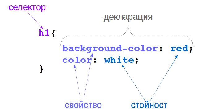
- selector: a pattern which select the elements to which the style will be applied.
- declaration: consists of a property and value, which describes a characteristic (like color, font-size), an aspect of how the element should be displayed.
- Reference:
- The Style Sheet Syntax @qt.io
- CSS Tutorial @w3schools
Apply Style Sheets in PyQt
- Qt Style Sheets support various properties, pseudo-states, and subcontrols that make it possible to customize the look of widgets.
- StyleSheets can be written as string, or read by a separate
cssfile and used as needed - A style sheet can be applyied to widget by setStyleSheet setter
			QWidget {
				border: 20px solid black;
				border-radius: 10px;
				background-color: rgb(255, 255, 255);
			}
			with open("qWidget.css", 'r') as fh:
				sheet = fh.read()

			widgetInstance.setStyleSheet(sheet)
Example: selector types
			self.btnSubmit = qtw.QPushButton('Submit')
			self.btnSubmit.setObjectName('btnSubmit')
			self.btnCancel = qtw.QPushButton('Cancel')
			/* apply red background-color to all QPushButton */
			QPushButton{
				background-color:red;
			}
			/* apply green background-color only to QPushButton with object name 'btnSubmit' */
			QPushButton#btnSubmit{
				background-color:green;
			}
- Reference: Selector Types
Pseudo State Selectors
- A widget can be in various pseudo-states, like hover, checked, and we can select it by it state
- Reference: Pseudo-States Selectors
			/* apply red background-color to all QPushButton */
			QPushButton{
				background-color:red;
			}
			/* apply blue background-color to buttons which are hovered */
			QPushButton:hover{
				background-color:blue;
			}
Apply style to only one widget
- We can select only one widget if we have given it an object name with
setObjectName()method, as we saw before. - But we can also apply one or more declarations only to one widget, with
setStyleSheet() - In these case, we do not need to put a selector{}, but just declarations, separated by ';'
			self.btnCancel = qtw.QPushButton('Cancel')
			self.btnCancel.setStyleSheet("""
				background-color:gray;
				padding:10px;
			""")
Qt Style Sheet Reference
Slides Code Example
Slides Code Example
The whole code for the 'Simple Text Editor App', used in these slides: